Making EVs more convenient through design
Helping Hopcharge make EV charging more accessible by going beyond traditional home & charging stations
THE TASK
Convenience at your doorstep
Driven by their ambition of Net Zero emissions, Hopcharge is speeding up the transition to e-mobility in India with an on-demand charging system for electric vehicles.
We were approached to build an experience to enable early adopters of Hopcharge to book on-demand charging sessions. Being early movers in the space, we agreed upon building a fast paced MVP.
THE APPROACH
Breaking it down
For the first version of the app, we prioritised simplicity for both, development and user experience. A good approach considers both, the requirements to build what’s designed as well as how the end-user will experience the product.
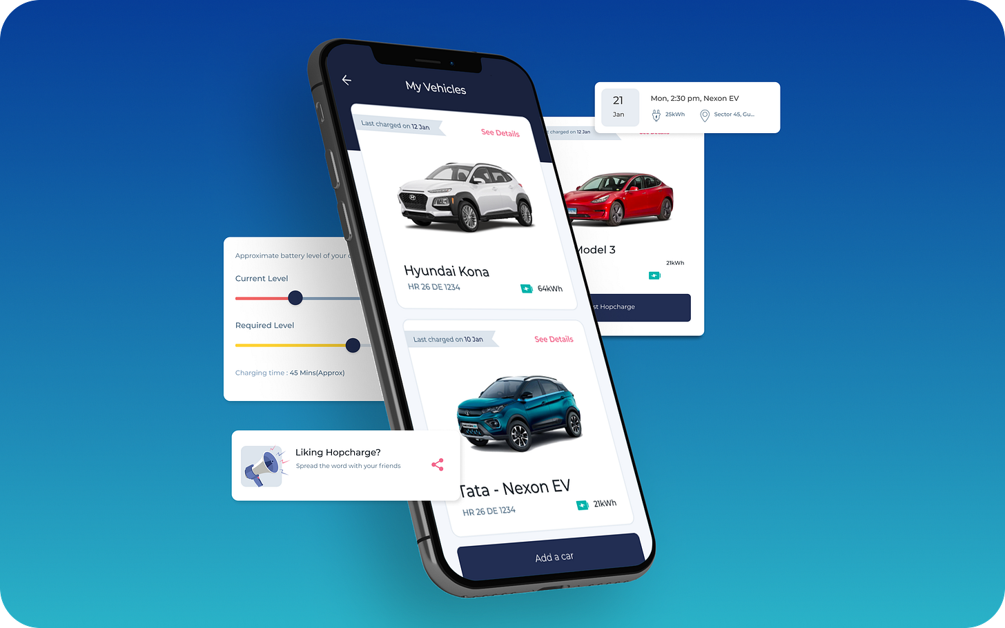
We used a modular framework of cards that would aid the quick development of the MVP and equip our designers to make flexible, creative, and scalable layouts.
Defining the experience
Our goal was to have the scheduling of a charging session booked in under one minute and to create an experience easy to navigate.
We broke down the journey into three broad processes - registration, adding a vehicle, and scheduling a charging session. Each process was built with assistive steps with simple and fast interactions to aid users through the actions.
The card framework helped group together related input fields that aided the process of scheduling a charging session to be broken down into smaller, quicker steps.
Visual style
We created a scalable visual language with strategic use of elements to complement and enhance the experience. The use of cards helps to group information.
The font used is Montserrat. The versatility of it with sizes and weights adds to the interface. The colours are used to aid the creation of a high contrast UI, and together, they help create hierarchy in actions.
THE SOLUTION
Simplifying the complex
While carving out the user journey, we realised that to add a vehicle and schedule a charging session, the user is required to fill out a lot of information.
To capture a volume of information in an easy way, we solved to give focused attention on each information field while keeping the process brief. But there’s more...
1. Tap, tap, done
Adding a car is generally a cumbersome process requiring multiple details, from the make to the registration number.
We used a multi-step single tap process to make adding a car feel seamless, like creating a character in a video game.
2. Building trust
Battery information is crucial in the booking process. The user is required to fill in the current level and the desired level, and the app is to suggest the ideal level. Based on this, the charging time and the cost is calculated. Accuracy is key to charging customers appropriately.
We used segmented sliders to record this information. This helps reach common charge points faster. The resultant experience is intuitive, with colours prompting ideal scenarios to the user.
3. As easy as 1 - 2 - 3
Scheduling a charging session is broken down into three steps, grouping together selection-related information in the first step, scheduling in the second, and reviewing information before paying in the third. It is made instinctive for the user to make their experience oh-so-seamless!
THE RESULT
Ship fast, grow fast
The entire process from designing to development to launching took under seven months. The app launched as an early beta in the NCR region in India to gain insights into the user experience.
Through the private beta, we learned that users are using the service in a repeated manner. This insight will help implement features in the next version to elevate the app’s experience.
THE FEEDBACK
User response
The success of user experience touchpoints is measured by the ease with which the intended actions are performed. In 6 months, we have:
800+ app downloads
Average rating of 4 stars


